

Our Visual
Identity
Logo
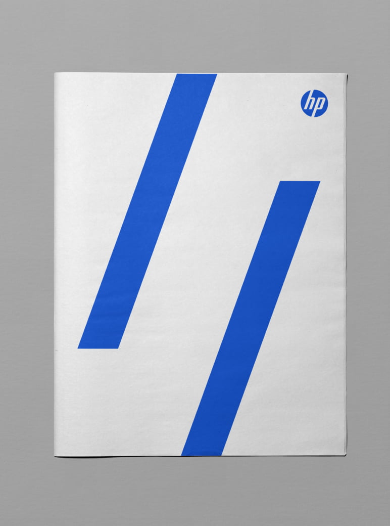
The most iconic brand asset we have is our HP Logo.
Blueprint
The logo is always applied in blue, and its primary branding application is against a white background. The white key line (8% higher than the blue circle) is visible only when placing the logo against a darker background or image.
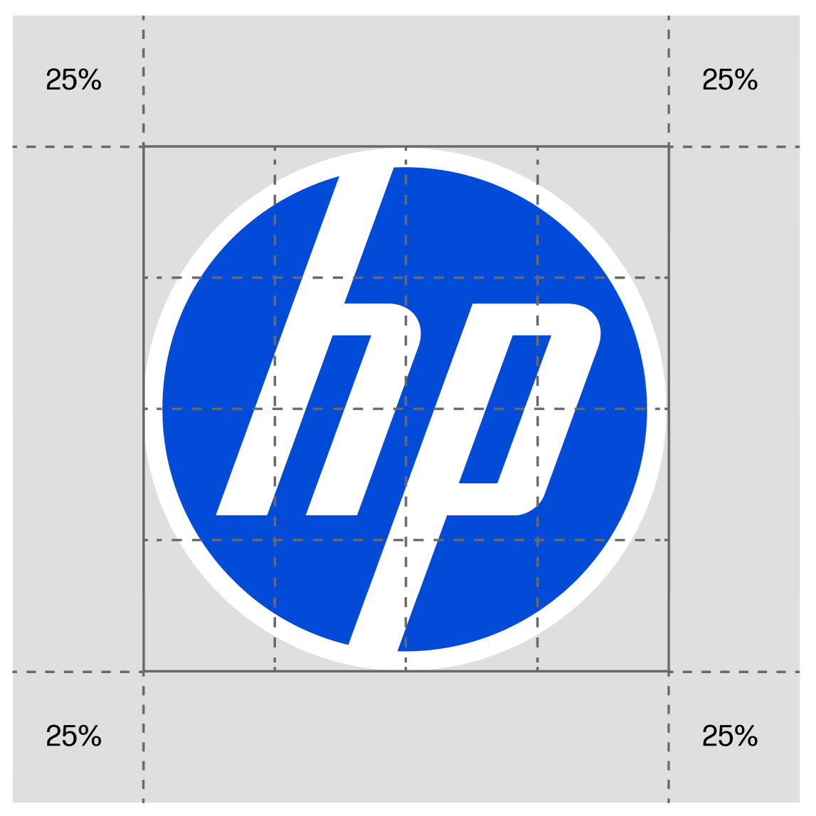
HP Logo Over White Background
A white background with logo and stripes in Electric Blue is the core of the brand. Following this principle, the thin white border around the logo disappears on a white background.
Clear Space
12.5% of the logo without the key line can be used as the minimum clear space.

Spacing Alignment
Aligned without considering the key line.
Minimum Size
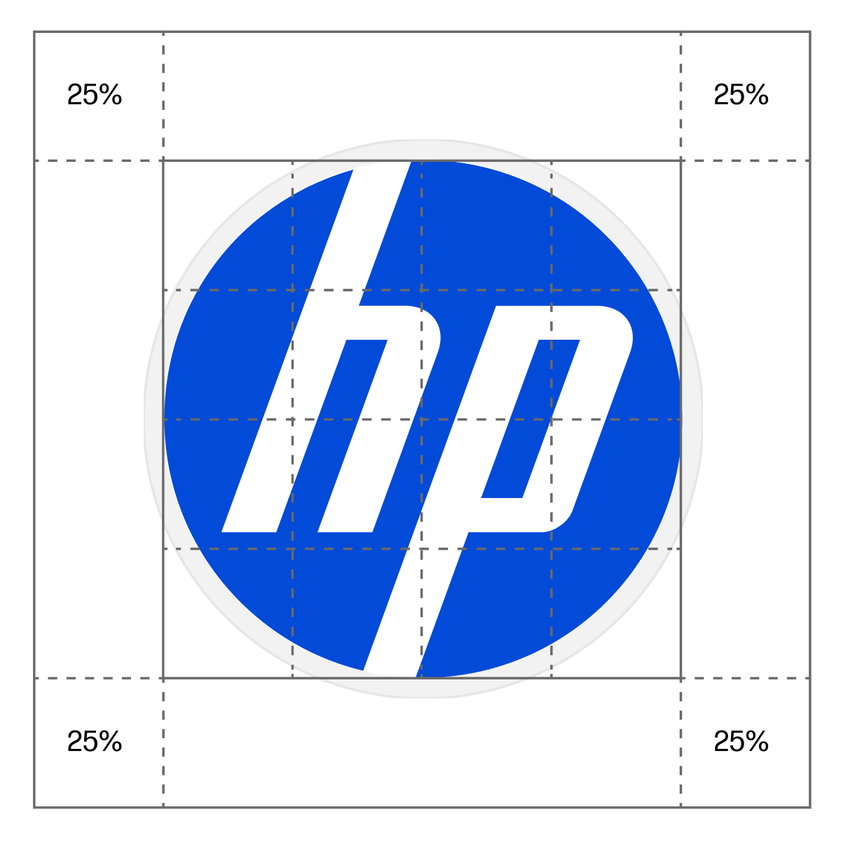
HP Logo Over Different Background Surfaces
When applying the logo to different surfaces and backgrounds (photography, shaped colors), we need to consider the key line in regards to alignments and size.
Clear Space
12.5% of the logo considering the key line can be used as the minimum clear space.

Spacing Alignment
Aligned considering the key line.
Minimum Size
Logo Size
To ensure consistency across communications, established percentile and fixed logo sizes are provided for print and digital formats. Below are percentiles for print. See the Technical Guidelines for fixed digital sizes.

Typography
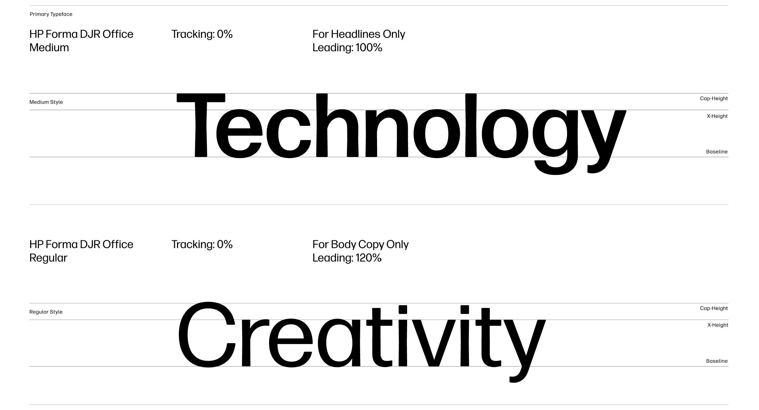
HP Forma DJR Office ensures message clarity and balances the visual system’s intensity.

Our Brand Font
HP Forma DJR Office is our new brand font. It follows the foundations of the original Forma DJR font but has uniform letterspacing eliminating the need to use Display and Micro. HP Forma DJR Office can be used for all communications and for all type sizes, from headlines to body copy to captions.
The Medium weight of HP Forma DJR Office is for headlines and Regular weight is for all other copy.
Capitalization and Punctuation
Use sentence case as the default for display copy, including titles and subtitles, to create a clear, approachable, and consistent reading experience. Imperative phrases and stylistic fragments should also follow sentence case, with punctuation applied intentionally based on whether the message calls for a definitive statement or a more open-ended tone.
Sentence Case
- Sentence case is the default for display copy (titles and subtitles).
- Imperative sentences and stylistic fragments also take sentence case.
Title Case
- Title case is used for navigation, short labels, navigation.
- Title case is always used for proper nouns - and never with punctuation.
End Punctuation
- End punctuation is used based on context: Do the words need a “solid, satisfying stop” or are they functioning as a more “open-ended cue”?
Benefits
Proper nouns (often product names) will stand out in display copy
Accessibility is stronger; sentence case is more legible than title case
Tone aligns with our non-boastful Voice and Tone guidance
Fosters greater consistency across the organization (print to digital; comms to marketing)
Our Digital Design Font
Forma DJR UI is a font tailored for digital software, also following the foundations of the original Forma DJR font. Unlike print communications, it is a variable font, with optimized letter spacing and stroke weights for maximum legibility on digital platforms. This font is exclusive to websites and software applications and can be found here.
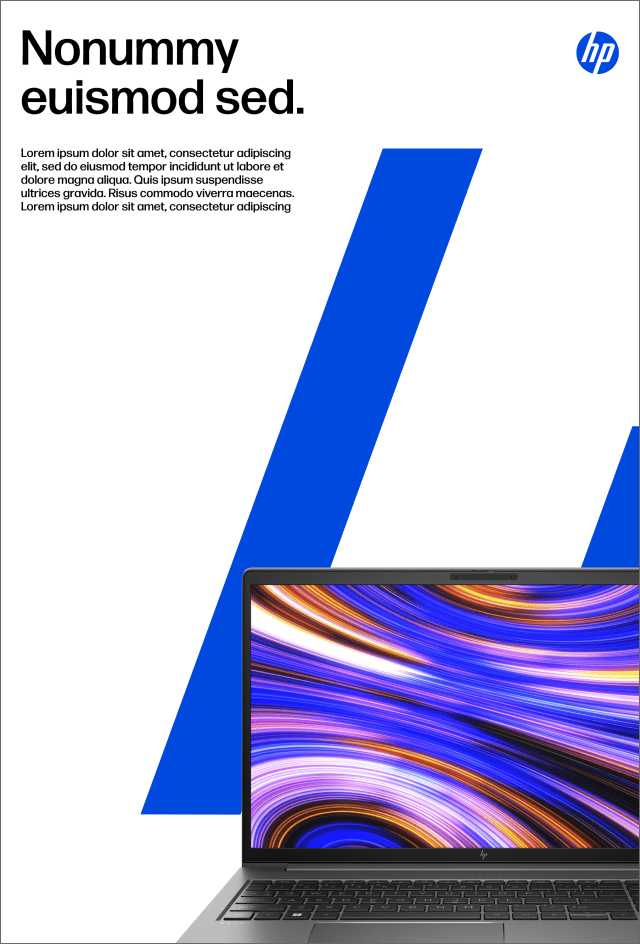
Stripe System
An identifying and wholly ownable feature of the HP design system, aside from our iconic logo, is a system of electric blue stripes, based on the slanted letterforms of our logo. The stripes give our identity system a dynamic future forward motion.


Stripe Grid
The stripes stem directly from our logo, matching both the 20-degree angle and grid of the letterforms.

Stripe Percentages
There are three percentages available for use: 100%, 500% and 1000%. Zoom in on the 100% stripes to achieve the greater percentages, always locking to the grid. When using all three scales in one campaign, the scales should remain proportionate to each other and consistent throughout all assets. Limit one scale per layout.


Stripes in Action
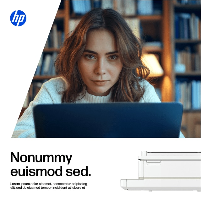
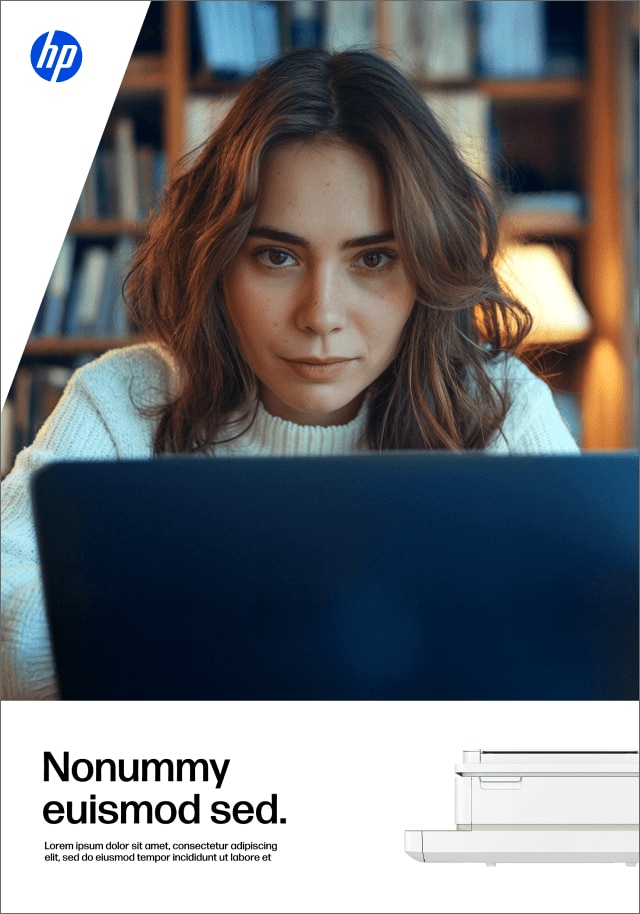
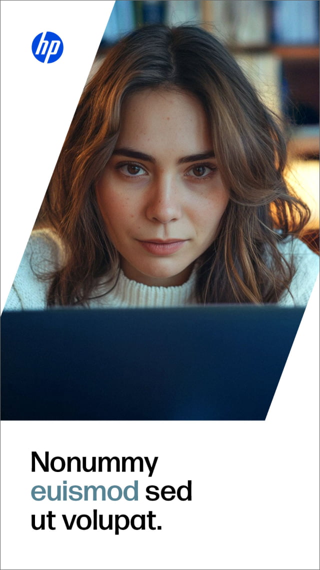
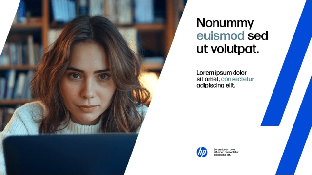
Choosing which stripe scale to use is flexible, and dependent on how much space you have. Only product photos can overlap blue stripes.
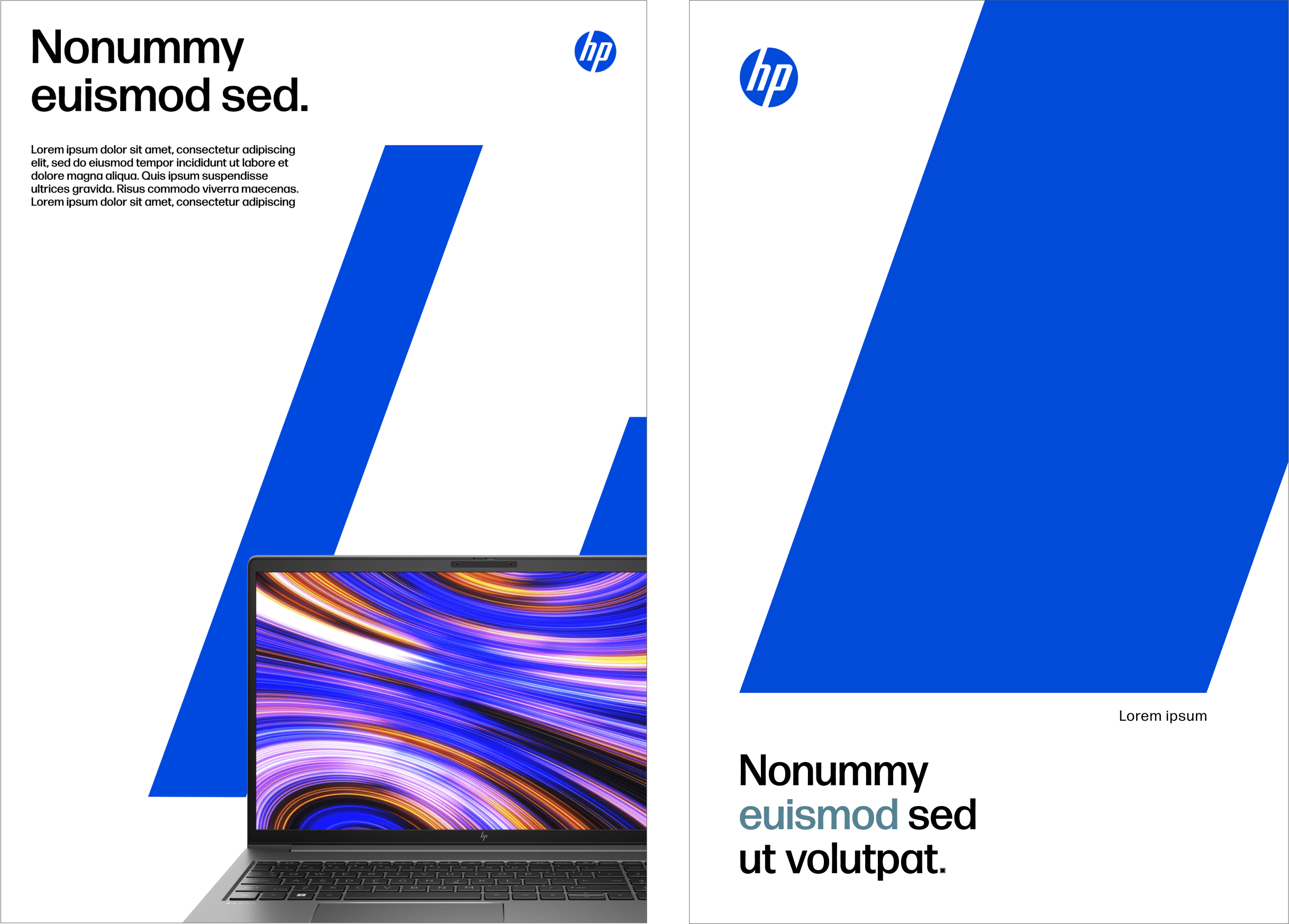
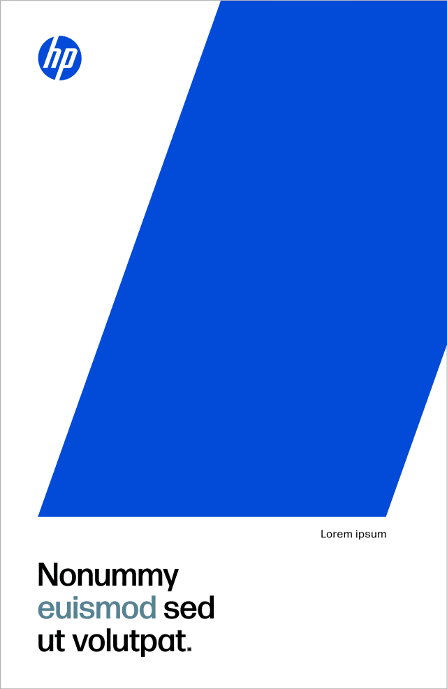
Stripe as Image
In addition to our stripes showing up in our electric blue, the 500% and 1000% stripes can hold images. Users can pair stripes as images with blue stripes if space allows.

500% Stripe as an Image

1000% Stripe as an Image

Stripe as an Image in layout.
Stripe As Image In Action
The only time to combine different scales in a single layout is when one stripe contains an image. Never use 100% stripe for images.


Working with Stripes
Along with our logo, the stripes help identify us as HP. Read the tips below for a quick guide.
- The stripes can be used with text, with product photography, as an image or all of the above.
- The larger the layout, the larger the stripe.
- The higher the volume of text, the smaller the stripe.
- Choose one scale per layout, unless a stripe is used as an image.
- Only product photography can overlay the stripe scales.
100% Stripe

- Use the 100% scale stripe in smaller layouts.
- Use the 100% scale stripe in medium or large layouts when volume of text is high.
- 100% stripes will always be blue, and cannot hold product lifestyle images.
- 100% stripes can pair with 500% and 1000% stripes used as images.
- Use a maximum of three stripes with a 100% scale per layout.
500% Stripe

- Use the 500% scale stripe in medium layouts.
- Use the 500% scale stripe when volume of text is low.
- The 500% scale stripe can be used as an image.
- The 500% scale stripe as an image can pair with 100% and 1000% blue stripes.
- Use a maximum of two stripes with a 500% scale per layout.
1000% Stripe

- Use the 1000% scale stripe in large layouts.
- Use 1000% scale stripe when volume of text is low.
- The 1000% scale stripe can be used as an image.
- The 1000% scale stripe as an image can pair with 500% and 100% blue stripes.
- Use a maximum of two stripes with a 1000% scale per layout.
Color
There can only be one blue—Electric Blue. It's our main color and represents our bold and confident brand. Our iconic Electric Blue has always represented reliability and technological advancements.

Core Colors
- Only use Electric Blue, black and white.
- Type should always be in black.
- White should always be used for clear and clean space.
- Electric Blue should be used for stripes and logo.
- Digital Display Advertising assets
- Print, out-of-home and video (TV included)
- Essentially anything released externally that is connected to paid media

Printing Our Electric Blue
Pantone 2132
Printing with Pantone inks (Pantone 2132) is the preferred method for printing our Electric Blue. Pantone 2132 matches the intensity of our electric blue in the digital landscape (RGB and HEX). To deliver spot color consistency, use a tolerance of ∆E00 = 1.5.
Printing CMYK
If printing with Pantone inks isn't feasible, print using CMYK inks (89C 64M). To deliver CMYK consistency, use the industry standard of GRACol 2006 and print the CMYK values with a tolerance of ∆E00 = 1.5
Print Expectations
Although the CMYK formula (89C 64M) and Pantone 2132 share similar hues, they will not match, as the intensity of PMS 2132 is impossible to achieve when printing with CMYK inks.
Please see the Technical Guidelines for additional details about the printing process, especially useful for your print service providers.
Secondary Colors
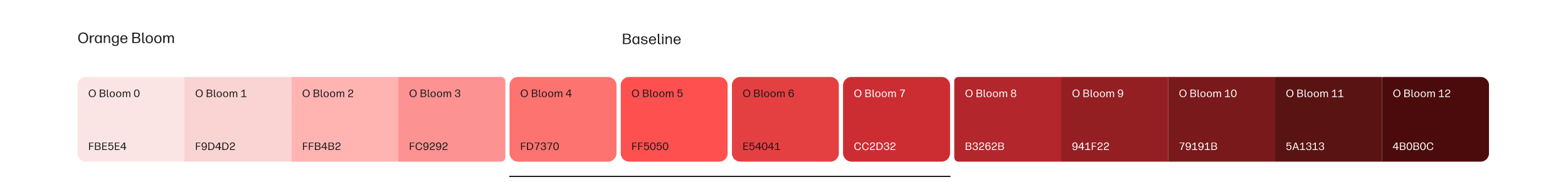
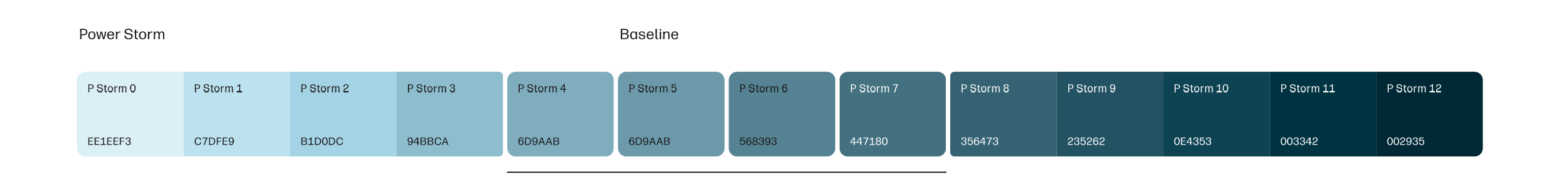
Our secondary color palette is comprised of two colors—Power Storm and Orange Bloom. Power Storm embodies the power of nature, discharging electrical energy and evoking a culture of courageous pioneering. This color should be used to represent HP’s technology and future innovation. Orange Bloom awakens creativity and inspires individuals to flourish, encouraging us to embrace our unique perspectives and cultivate a more inclusive community that blooms together. This color should be used to highlight action and creativity.

Printing Our Secondary Colors
Printing Power Storm: PANTONE 2212 C shall be matched with a tolerance of ∆E00=1.5. When printing with CMYK inks, GRACoL 2006 CMYK: 69c 32m 31y 7k shall be matched with a tolerance of ∆E00=1.5.
Printing Orange Bloom: PANTONE 178 C shall be matched with a tolerance of ∆E00=1.5.
When printing with CMYK inks, GRACoL 2006 CMYK: 76m 46y shall be matched with a tolerance of ∆E00=1.5.
When to Use Secondary Colors
HP-owned Experiences
Power Storm and Orange Bloom can be used sparingly within both physical and digital experiences that are wholly owned by HP.
HP Brand System
Confident/Pioneering/Human
Core Colors
Exclusive Universe of the Brand
Secondary Accent Colors
Topics that Encompass the Brand Universe

How to Use Secondary Colors
Emphasize Innovation or Creativity
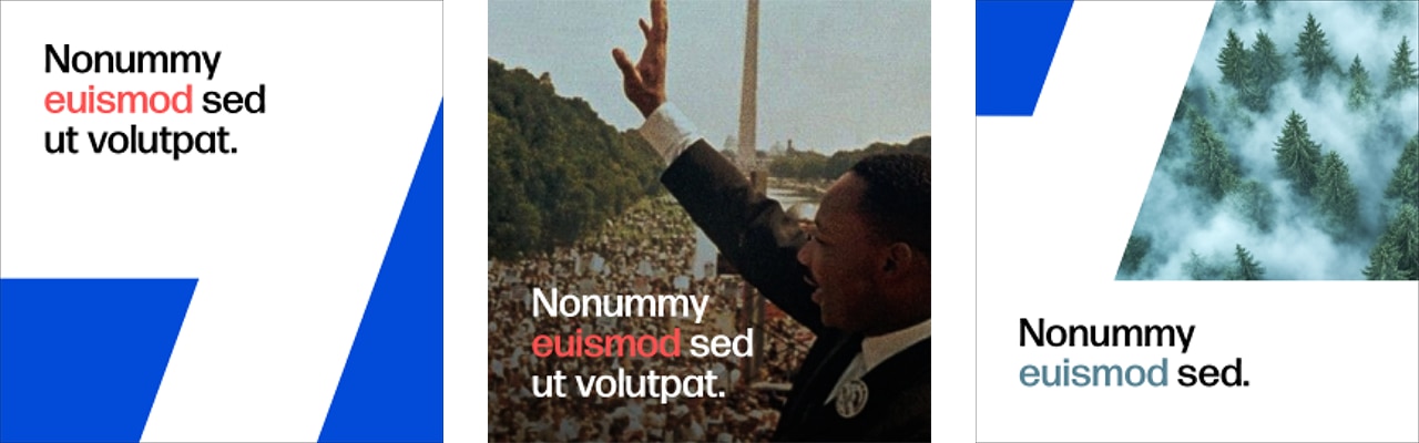
Secondary colors can be used to highlight one word within headline and subhead copy to emphasize creativity (Orange Bloom) or innovation (Power Storm). Don’t use both colors in one headline and one subhead.

Core palette tints
Tints of our core palette are used for information design. Use the secondary color tints 4 through 7 for maximum legibility when highlighting text. Hex codes are provided below.

Using secondary colors to highlight words
Highlighting Titles & Subtitles
- Colors: Use Power Storm and Orange Bloom for single keywords or short phrases.
- The 20% Rule: Highlighted text should not exceed 20% of the total title length.
- Restraint: Use sparingly to maintain visual impact and avoid clutter.

Highlighting on Images
- White Backgrounds: Always use core baseline colors for maximum readability.
- Consistency: Maintain the same style across all image-based display copy.
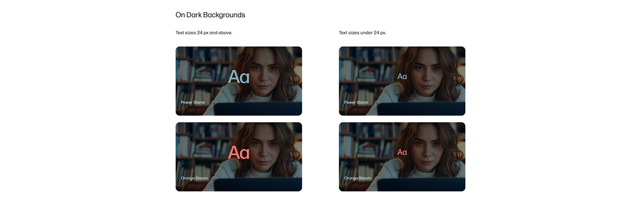
Core Palette Tints
- Manual Check: Always verify contrast manually since image backgrounds vary.
- Legibility: Use tints to ensure clarity across various background types.
- Tone Selection: Use only shades 4 to 7 to ensure the highlight remains visible against text.
Photography
Re-ignite our founders’ pioneering spirit through candid photography that celebrates a genuine, focused interaction with technology.

Product Lifestyle Photos
- Aim for authentic moments, inviting viewers into the scene.
- Subjects should be immersed in flow, focused at work.
- Make technology the hero, between the subjects and the viewer.
- Bring our blue world to life through blue undertones, props and wardrobe.
- Select or build environments that feel realistic and natural.
Existing Imagery

Follow the steps below to adapt existing product lifestyle photography to the new blue effect.
- Shift overall lighting to cooler tonality without loosing warmth of skin tones, brightness in whites and overall contrast, clarity and sharpness.
- If background in neutral, light, shades of blue or yellow, teal or green, shift the background tonality to skew more blue by adjusting color levels.
- Additional color shifts can be applied to clothing, furniture and other props within the photo with restraint.
- Always maintain a natural and authentic color grading. If a photo does translate well with these adjustments, dont use it.
Do’s and Don’ts


Product Photography
Guidance for creating and using product photography can be found in the NPI Guidelines on the resource page.
Co-Branding
When pairing our HP Logo with partner logos, separate them with a thin, diagonal divider line and keep one HP Logo of spacing between the logos.

General Guidance
- The size of both logos should match vertically. Remember: This vertical alignment must be done without considering the key-line of the HP Logo.
- The spacing between the logos should be the width of the HP Logo. Lockups should appear on a white background.
- Slash thickness should be one-third the thickness of the space between the letter "H" and "P" in the HP Logo.
- The height of the dash needs to align with the top of the "P" and the bottom of the "H" in the HP Logo.
- The slash positioning should always be between the logos, centered horizontally
- A deeper dive into alliance lockups and aligning with our partners is slated for a future phase. Refer to the latest alliance guidelines for compliance.
Motion Graphics
The design system draws on the letter forms in our logo to evoke a sense of moving forward. The animation builds on these elements to define its movement.

Animation Curve
To ensure consistency and scalability, an animation curve was carefully designed to deliver a dynamic energy.
Key Animation Principles
There are four important points to consider when creating new animations using our stripe system.


Logo Animations
Main Version
The logo conveys confidence and growth by synthesizing attention through a single movement.
Logo Animations
Alternative Version
Animation that shows the construction of the stripes, with multiple directions (up and down).
End Frames

16:9 / Main Version
In this version, the stripes transition between the footage and the final card.
End Frames

16:9 / Alternative Version
Animation that shows the construction of the stripes, with multiple directions (up and down) in sync with the appearance of text and logo.
Layout Animations

Vertical / Stripe 100% / Photography / Product
When we have multiple stripes, they move away from each other (in two different directions).
Layout Animations

Vertical / Stripe 1000% / Photography / Product
Stripe, Image and Product
When we have one stripe on-screen, it should always go up.


